

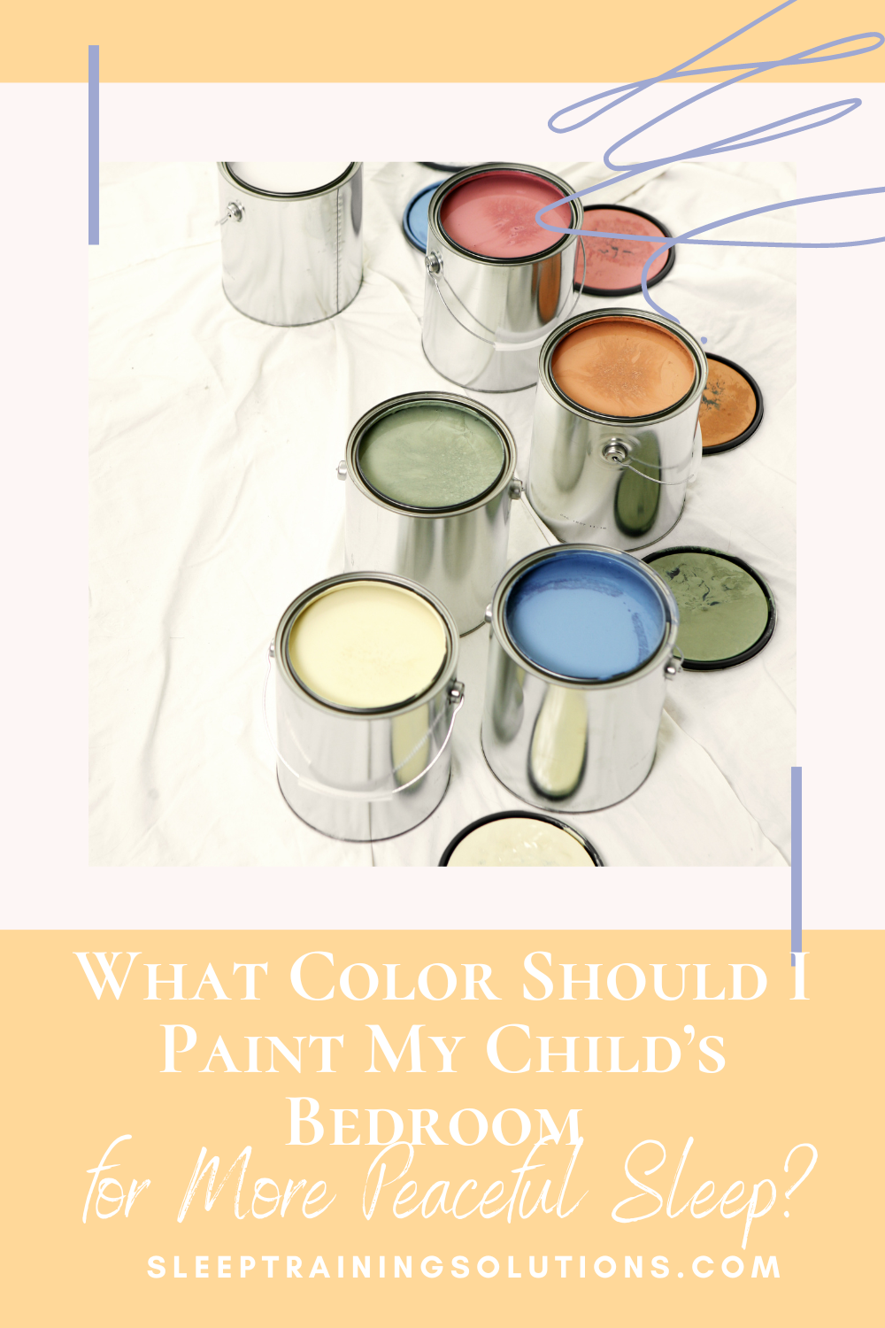
What Color Should I Paint My Child’s Bedroom for More Peaceful Sleep?
Last week, a mom asked me, “What color should I paint my child’s room for a more peaceful sleeping environment? She loves Barney, but is purple for the walls going to stimulate her?”
I LOVE when parents are thinking this way! Obviously we want our kid’s rooms to look nice and “kid-like” but it’s also important to optimize the space for good sleeping too!
The color that is painted on the walls will influence mood, thoughts and emotions. For the most soothing sleeping environment, choose a color that evokes calmness and relaxation in your child’s bedroom (as well as your own).
So how do you choose the right one?
In general, neutrals and earth tones are good choices. Neutrals (darker white, gray, beige, taupe) are very calming and relaxing and will neither stimulate, nor depress, mood or emotion. Darker colors will help a larger bedroom feel more cozy, while lighter colors will give the room a more spacious feel.
Here’s a little cheat sheet for the emotional properties of each color:
RED: higher energy, aggressiveness, strength, power, irritability; also encourages appetite (which is why many fast food restaurants use red on their signs and storefronts). Studies have shown that red can also raise blood pressure and heart rate. Best for the dining room, not the bedroom!
ORANGE: increases energy levels, evokes feelings of excitement and exuberance. A perfect color in an exercise room, NOT a good choice for a bedroom color!
YELLOW: happiness, joy, uplifting, optimism. But having large amounts of yellow in a room or darker shades of yellow can actually increase tension, so use small amounts and/or paler shades. A soft, pale yellow would be a good choice for a child’s room, if you’re doing a gender neutral bedroom. We didn’t find out the sex before baby #1 was born, so we picked a pale yellow for three walls of the nursery (and a mural for the last wall, see below).
GREEN: restful (ding, ding!), calming, relaxing, balance, nature, organic, growth. It’s no wonder that green is a dominant color in hospitals, medical offices and at spas. A GREAT choice for a bedroom!
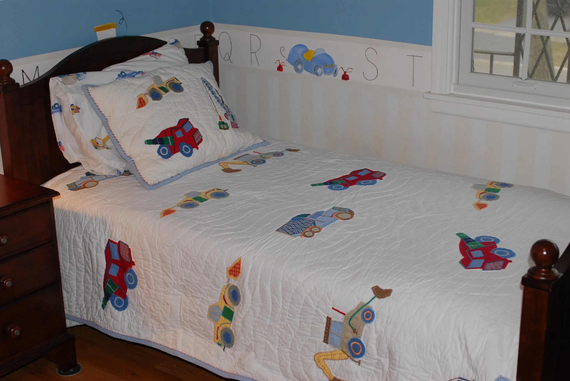
BLUE: relaxing, comforting, calming. Studies have shown that blue will have the opposite effect of red, slowing down respiration, heart rate and blood pressure and lower body temperature. Darker blues can evoke feelings of sadness, so stick to the warmer, lighter blues–periwinkle or sky blue–that evoke feelings of calm, quiet and being protected. Here is a picture of my older son’s room with a soft blue and painted white and beige stripes below the border…we’re now in the process of painting over the alphabet and truck border and getting a solid color duvet since he’s getting a bit old for that :)
PURPLE: this one can go both ways, depending on the shade. Darker purple is associated with sophistication and elegance and lighter and paler purples (violet, lilac or lavender) are associated with calm, relaxation and rest. Softer tones are much more soothing for a child’s bedroom.
PINK: soothing, calm, soft, innocence. Again, a paler shade will be more soothing…steer clear of the darker, more intense pinks in a bedroom.
WHITE: calm, peace. This default color is always a great choice for creating a relaxing bedroom environment, BUT most white rooms have lots of bursts of color, so keep that in mind when choosing wall, floor and window coverings, as well as bedding (using the other calming colors in your color accents would be a great opportunity).
BROWN: contentment, calm, cozy. As mentioned above, neutral colors in the brown family (taupe, beige) are excellent choices for a bedroom.
So as you can see color psychology is a very real thing! Your best bet for a calm and relaxing bedroom environment is a light green, pale yellow, warm blue, light purple, white or a brown tone…or using these colors as accent colors in window and floor coverings (or painted borders or murals).

I have an exceptionally gifted artist in the family–my mom!–and she painted this “Wind in the Willow” inspired mural right before my oldest was born (WAY before I became a sleep consultant and thought about color psychology!) with soft blue, light green, violet, pale yellow, brown and darker white. (And our chocolate brown lab, Max, perched protectively in the corner!) Sitting across from this mural in the glider, feeding the last bottle of the day and/or reading bedtime stories, I have enjoyed looking at this for the past 8 1/2 years since my oldest was born. Such a soothing scene, with a little bit of whimsy. Perfect for a little one’s room. We placed the crib right under the boot :)
I know sometime soon son #2 will decide he wants trucks or sports instead of Mr. Toad…but I’m sure my mom will be able to work her magic again!

Related Posts:


This post is for informational purposes only and may not be the best fit for you, your child and/or your personal situation. It shall not be construed as medical advice. The information and education provided here is not intended or implied to supplement or replace professional medical treatment, advice, and/or diagnosis. Always check with your child’s physician or medical professional before trying or implementing any information read here.